The Highlands
Porter, Texas
Role: Logo, Brand Identity, Iconography, Spot Illustrations
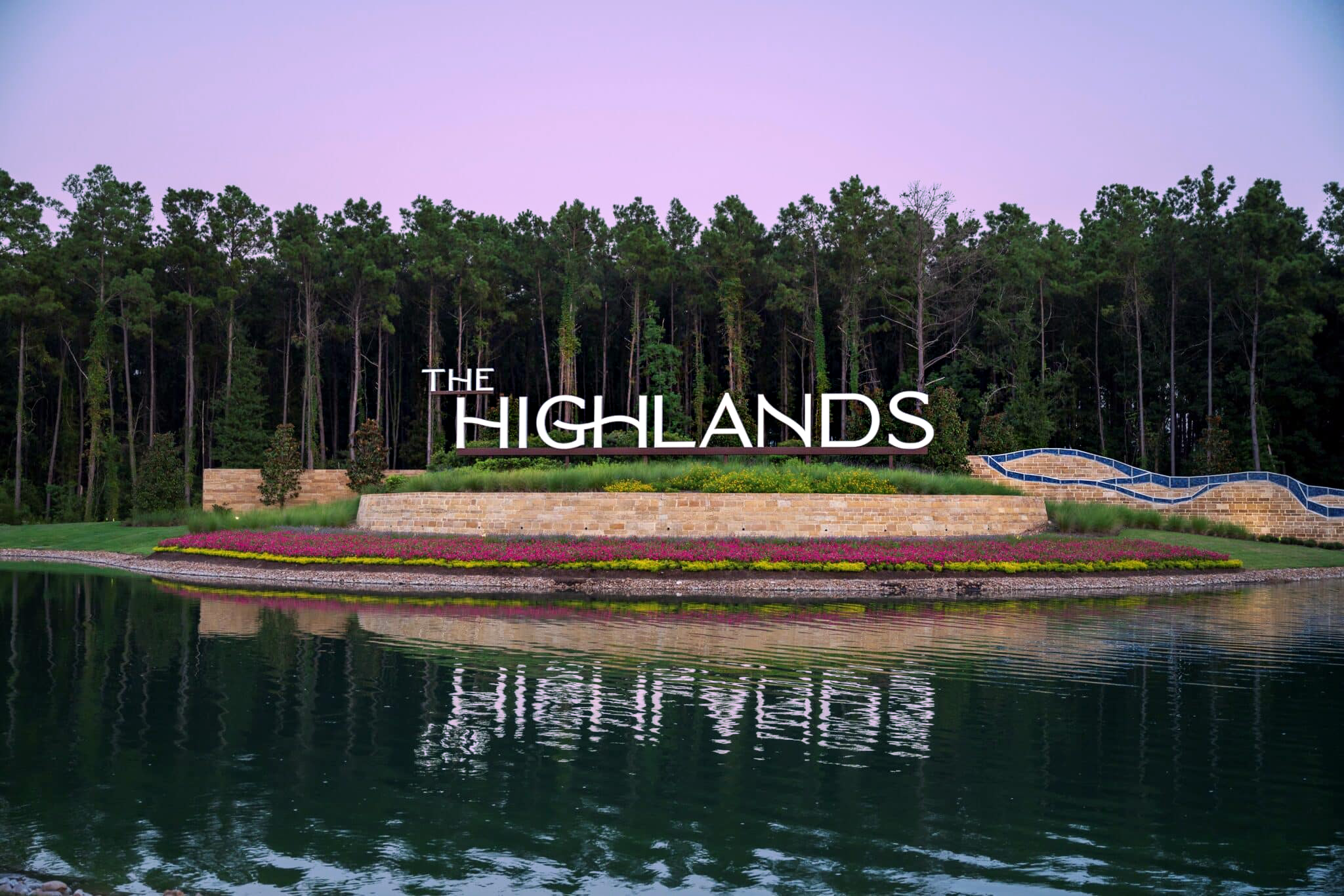
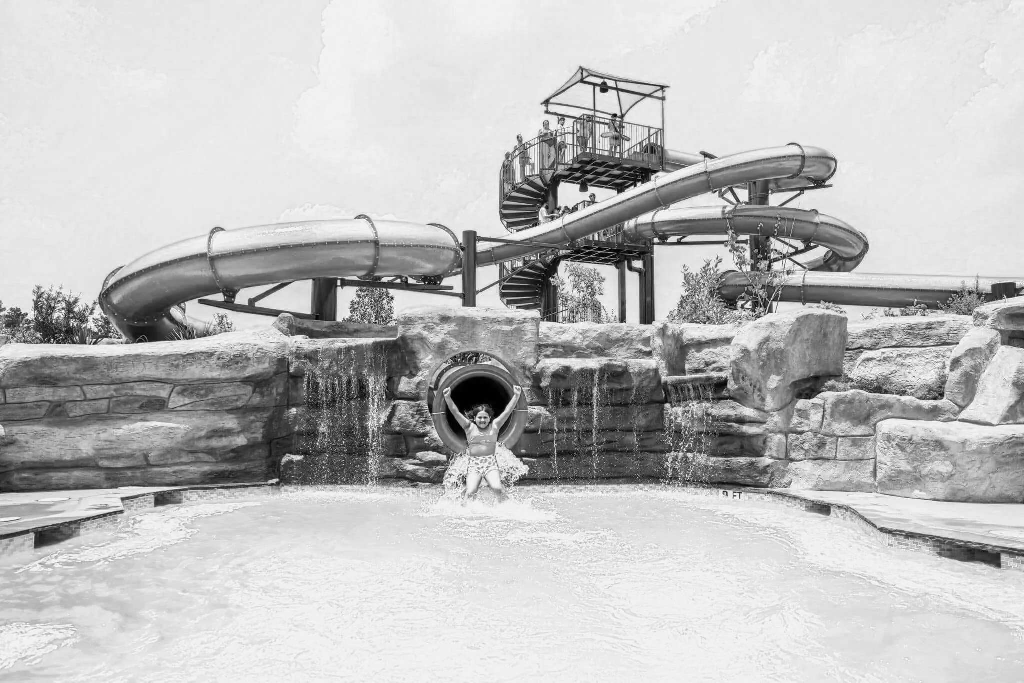
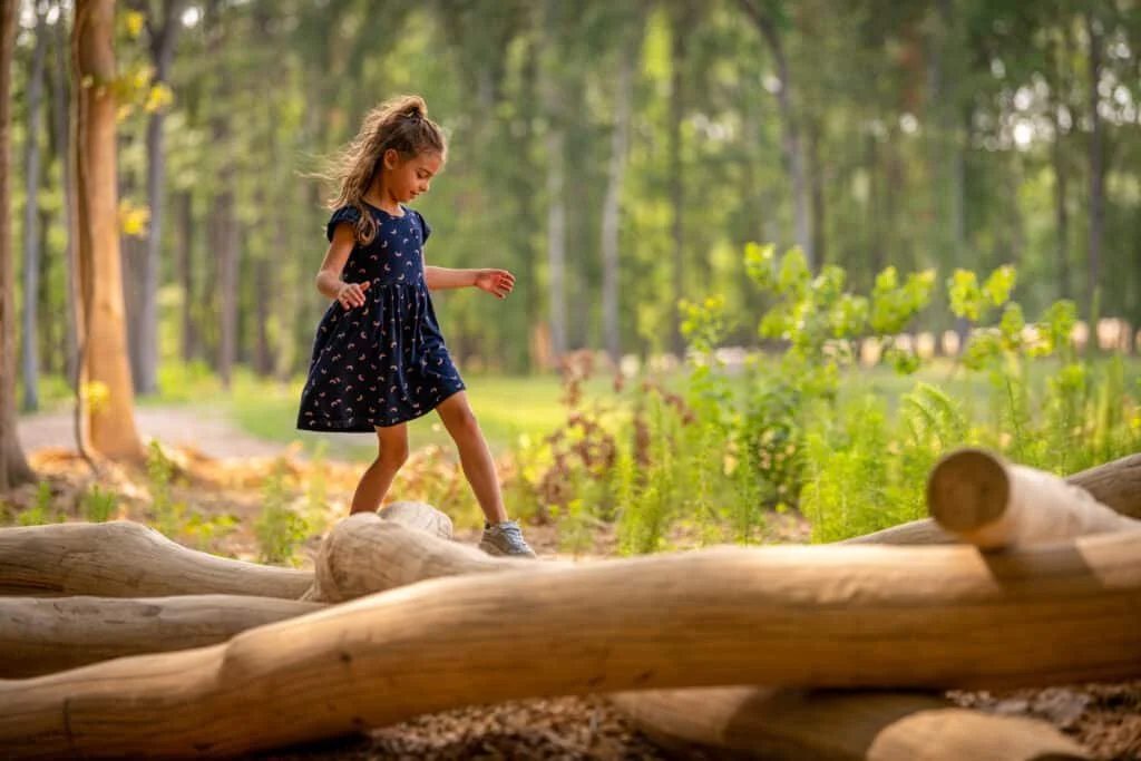
The Highlands is a 2,300-acre master-planned community in Porter, Texas, inspired by national parks and outdoor living. With 30 miles of wooded hiking and biking trails, a waterpark, lazy river, and the Highland Pines Golf Club, “getting outside” is woven into every part of the community. L&P Marketing hired me to create a logo and brand identity to captured the community’s connection to nature, along with the relaxed, camp-inspired spirit that makes The Highlands feel like a place to get away from it all.
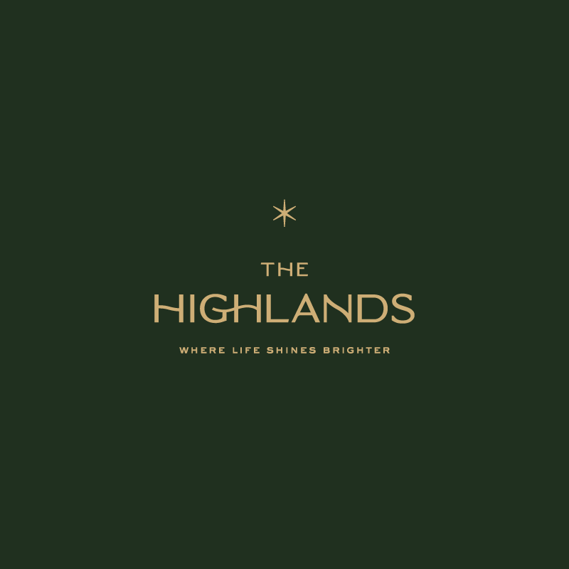
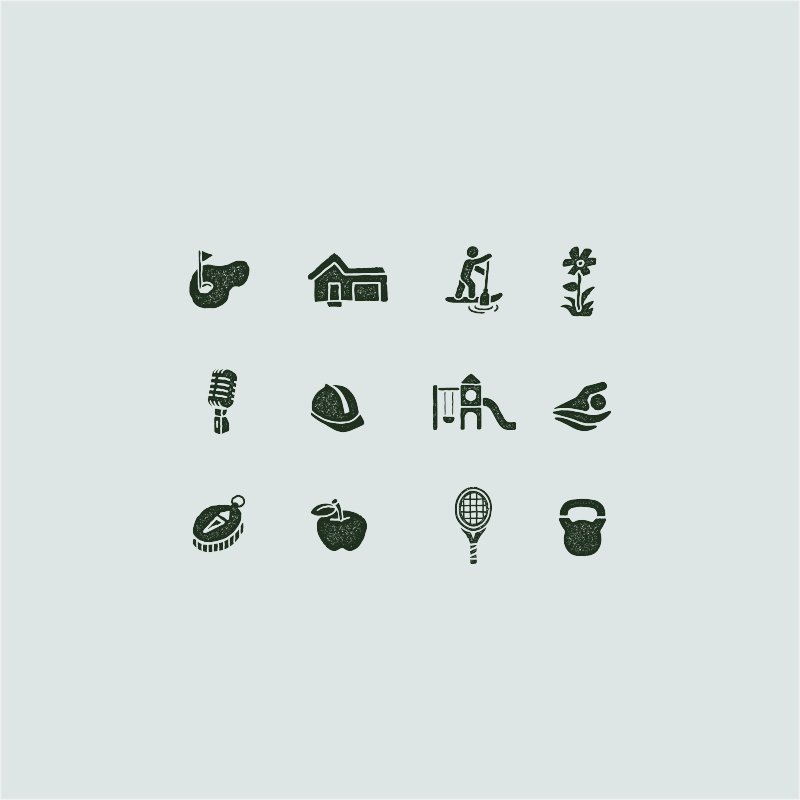
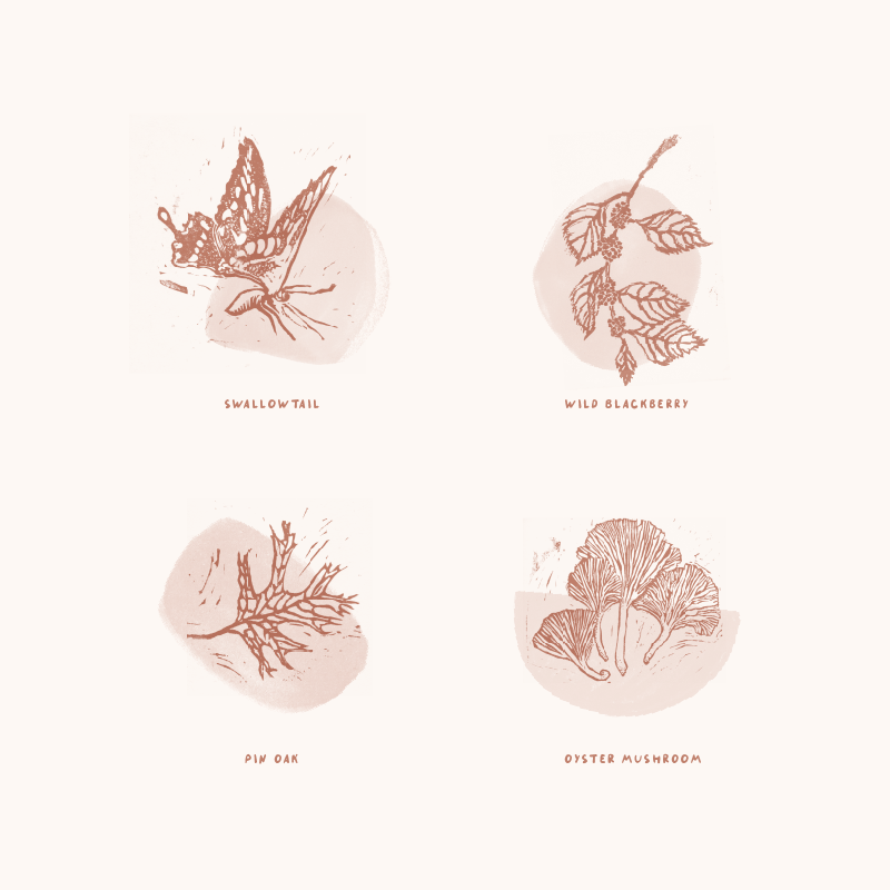
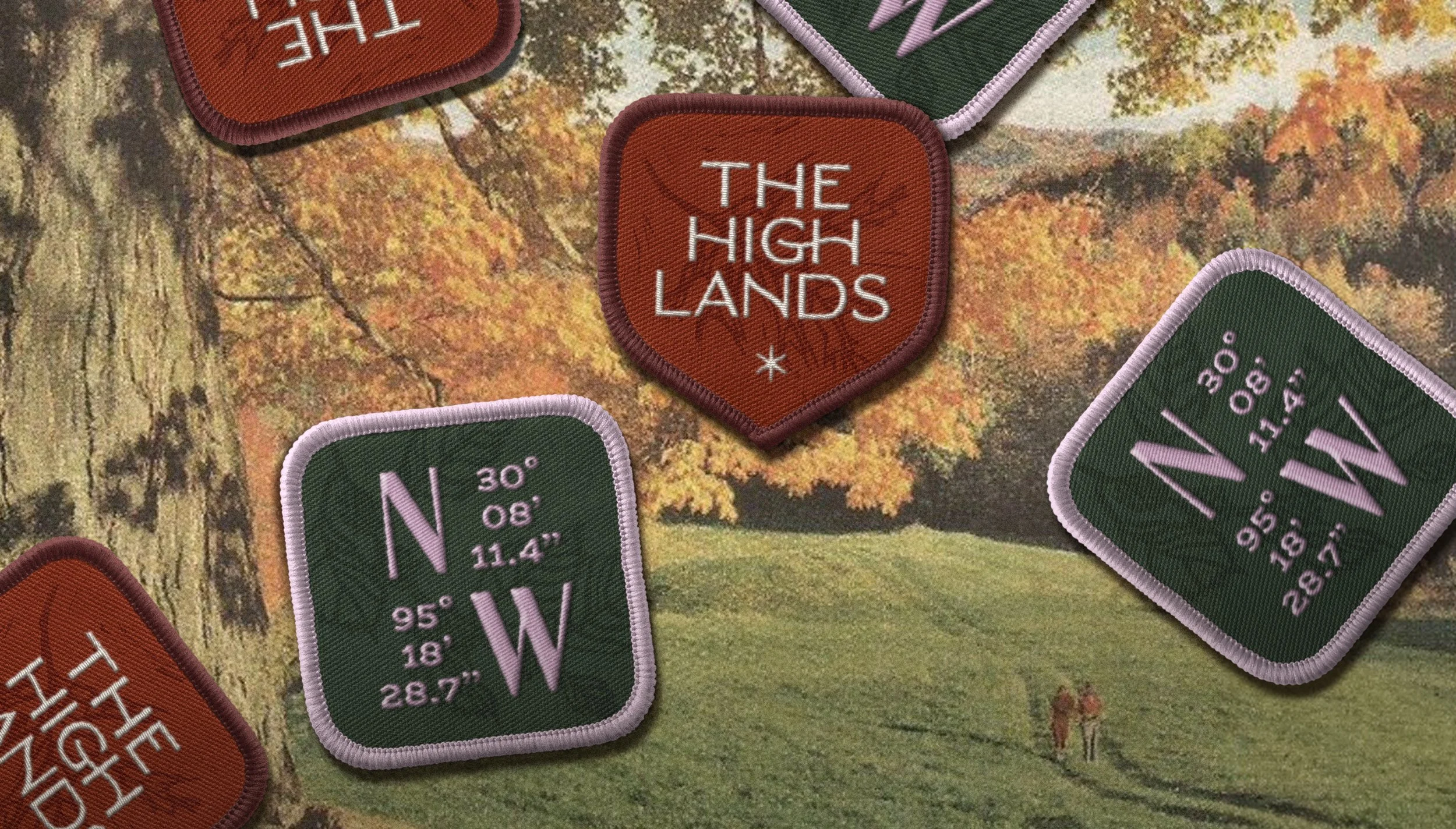
During our discovery phase, The Highlands team gravitated to the nostalgic charm of national park signage and maps. They also had a specific request: “We love the idea of letters with a natural sway or movement.” My goal was to capture this character in a way that felt fresh, rather than kitschy or rustic. I drew a six-point star paired with a custom logotype to create a timeless and upscale lockup. From there, I had room to be more playful with the rest of the brand, creating spot illustrations and supporting elements to give the community its distinctive outdoorsy feel.

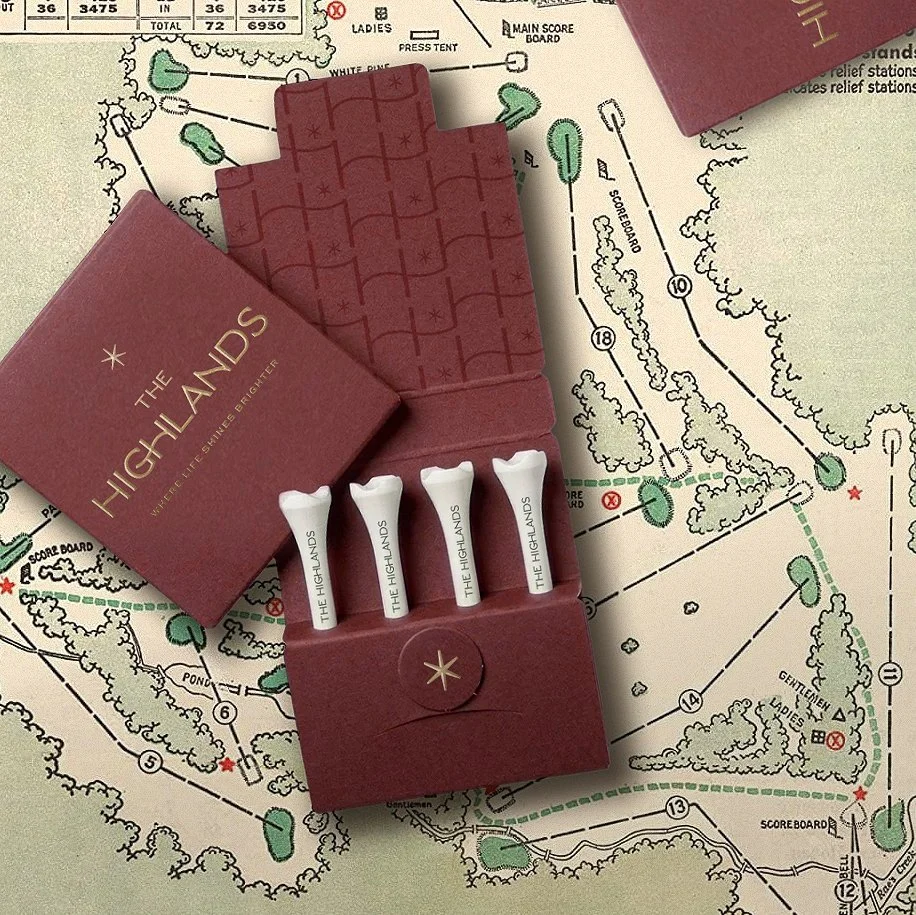
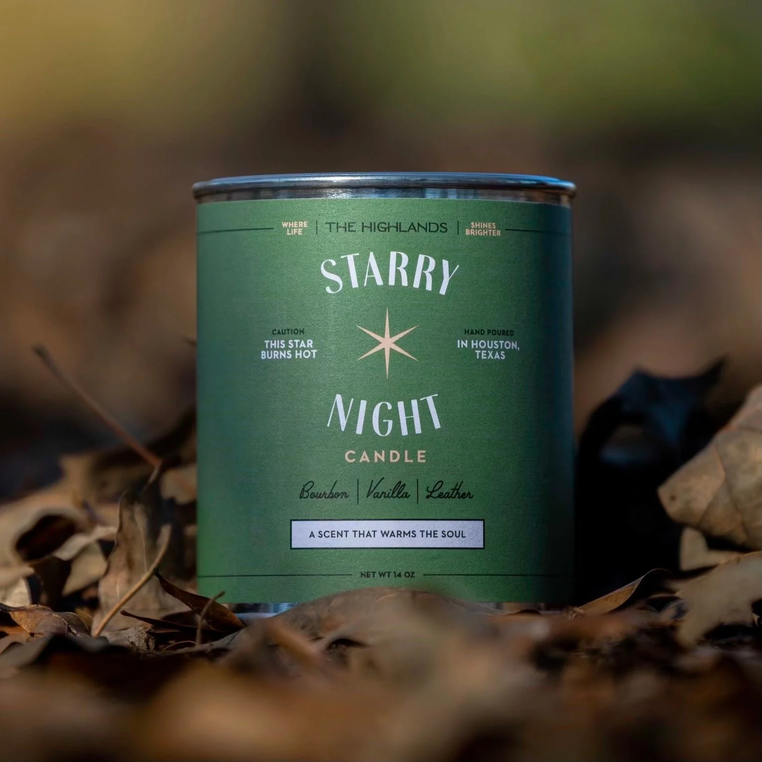
My favorite part of the process was hiring my mom to create a suite of block-printed spot illustrations, and my husband to help with the stamped icon library.
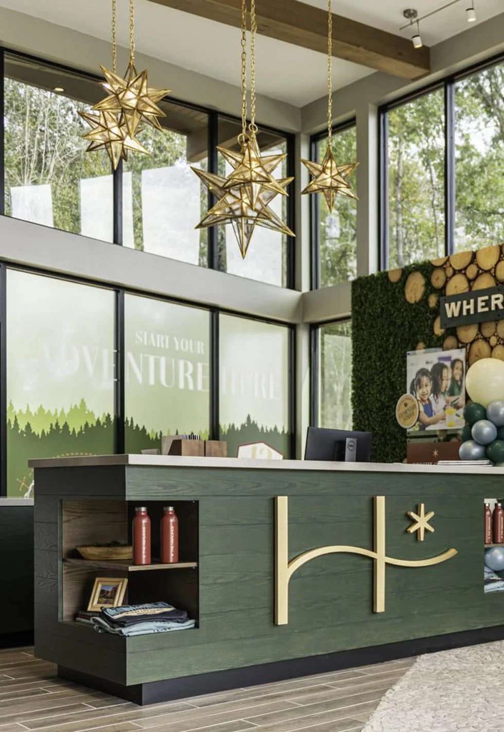
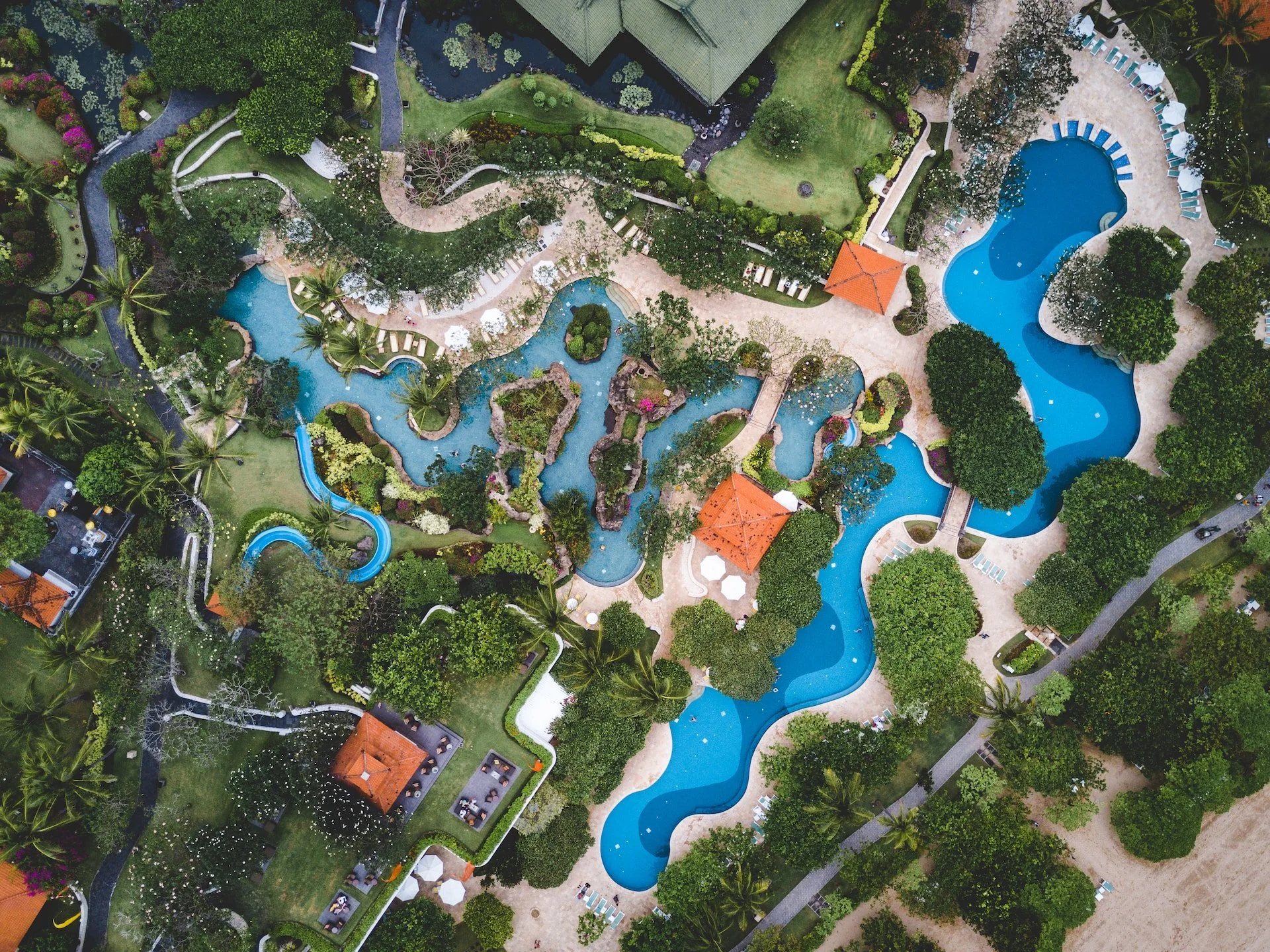
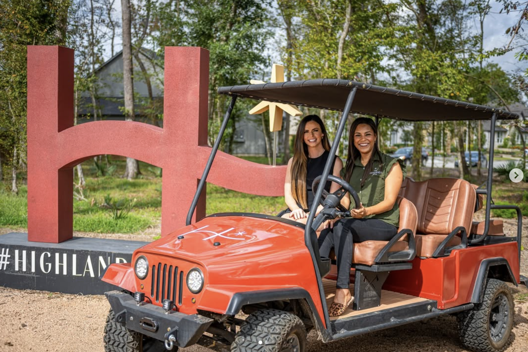
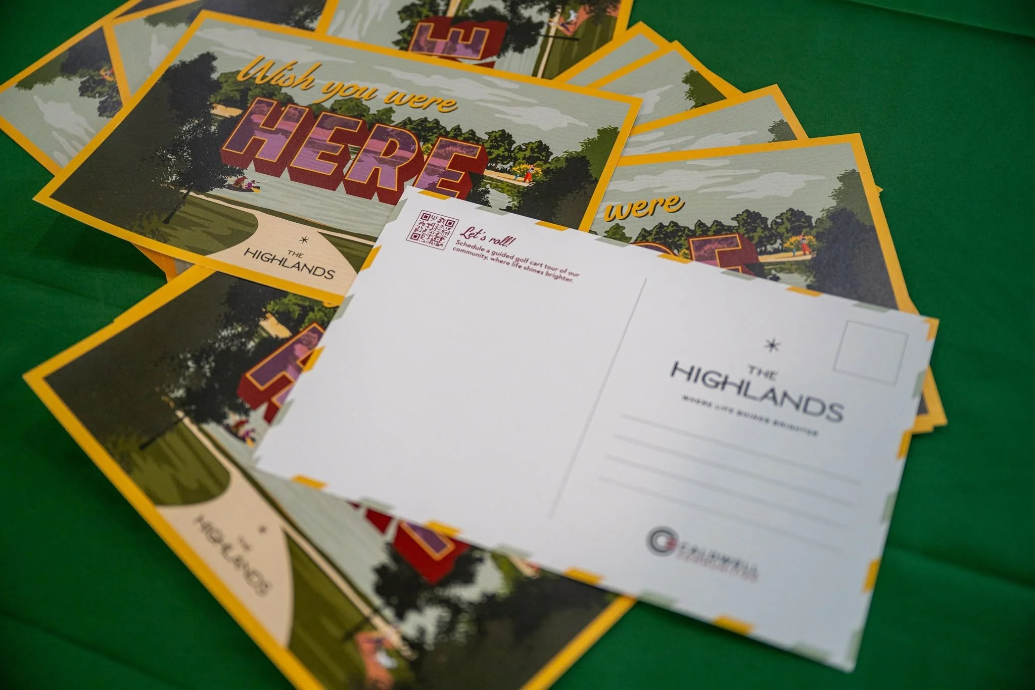
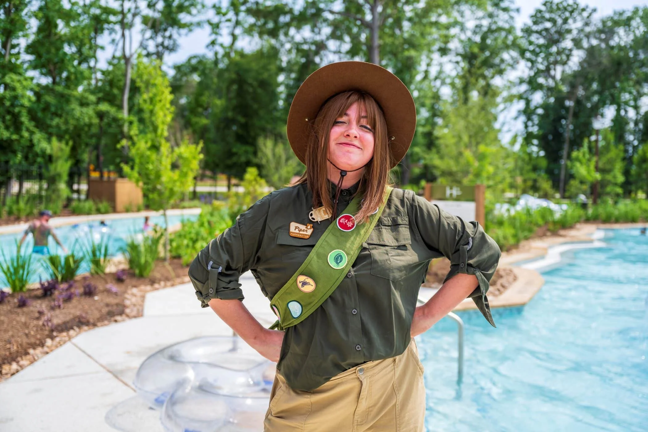
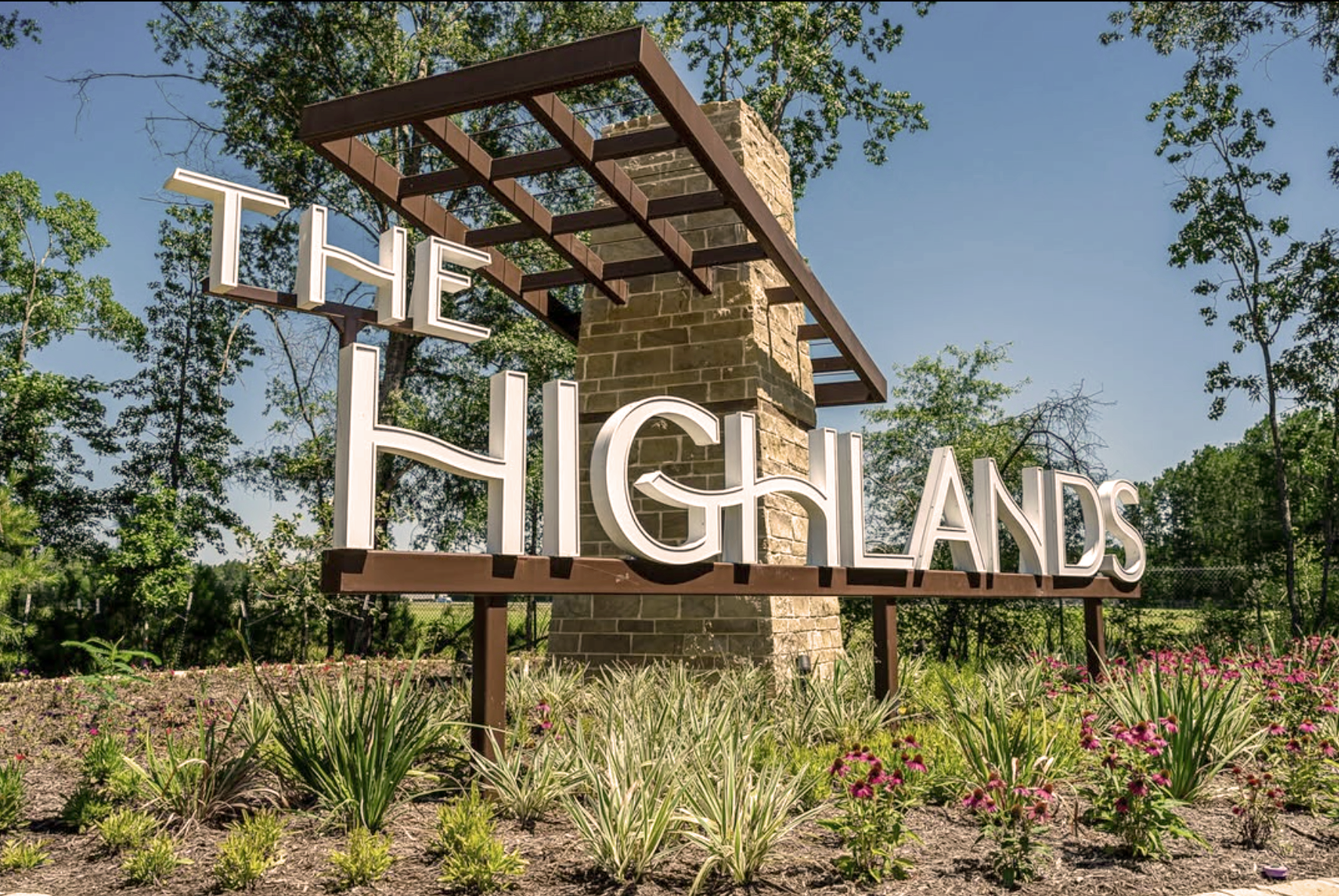
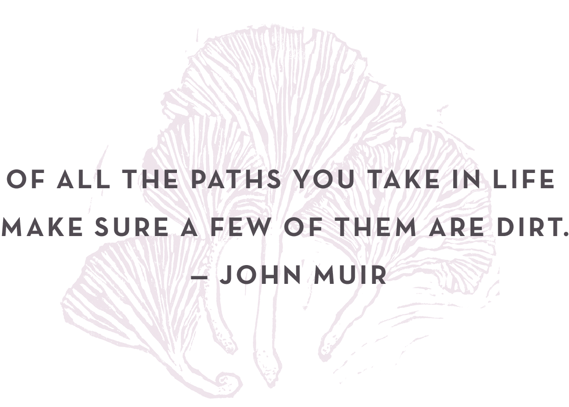
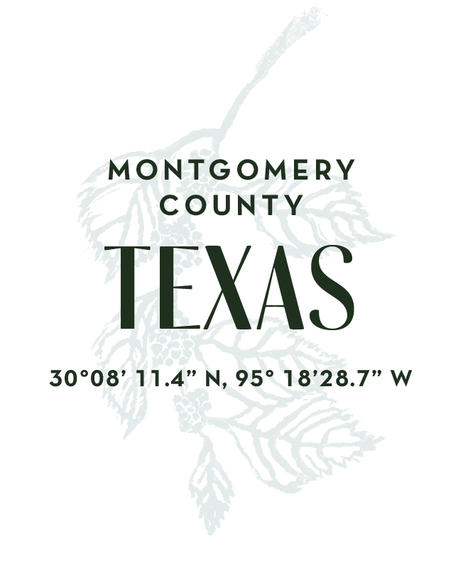
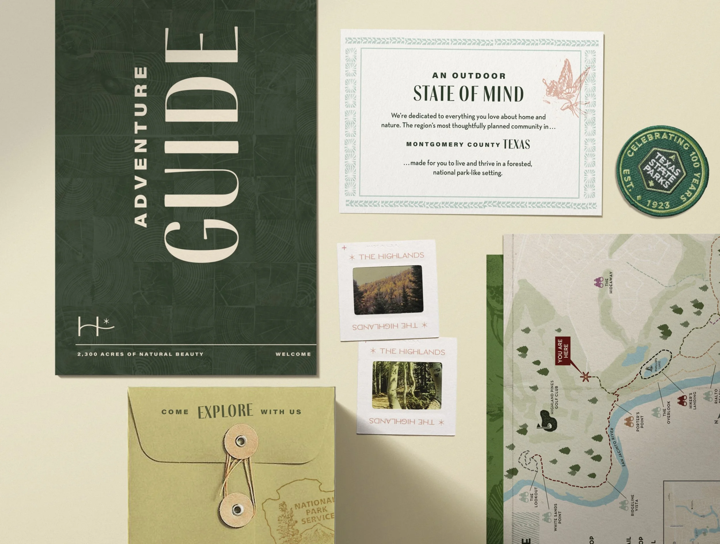
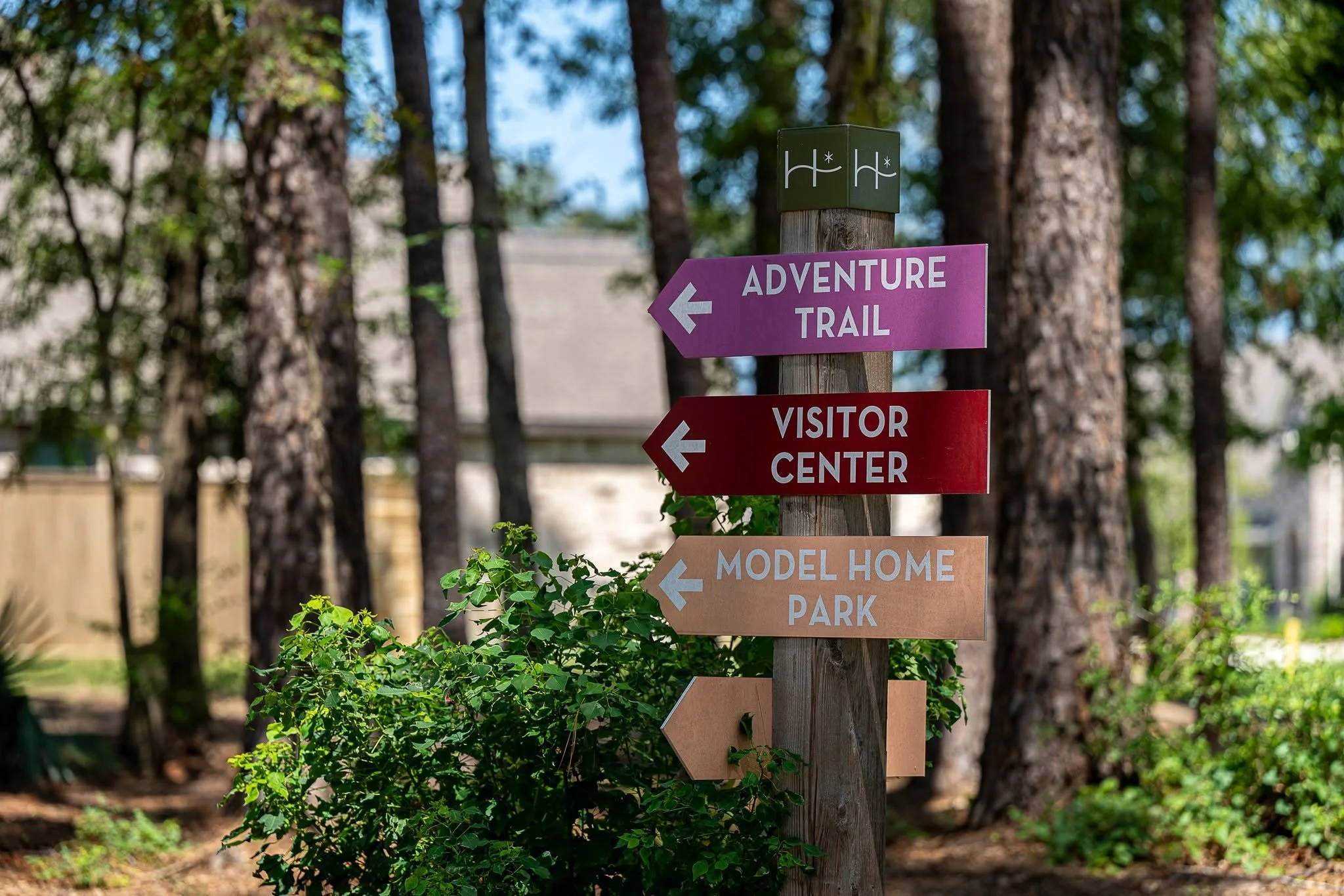
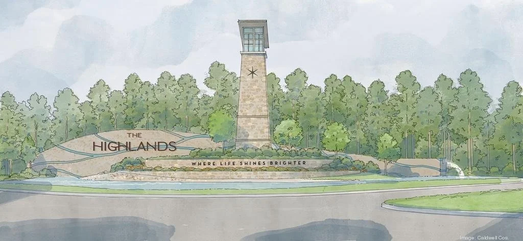
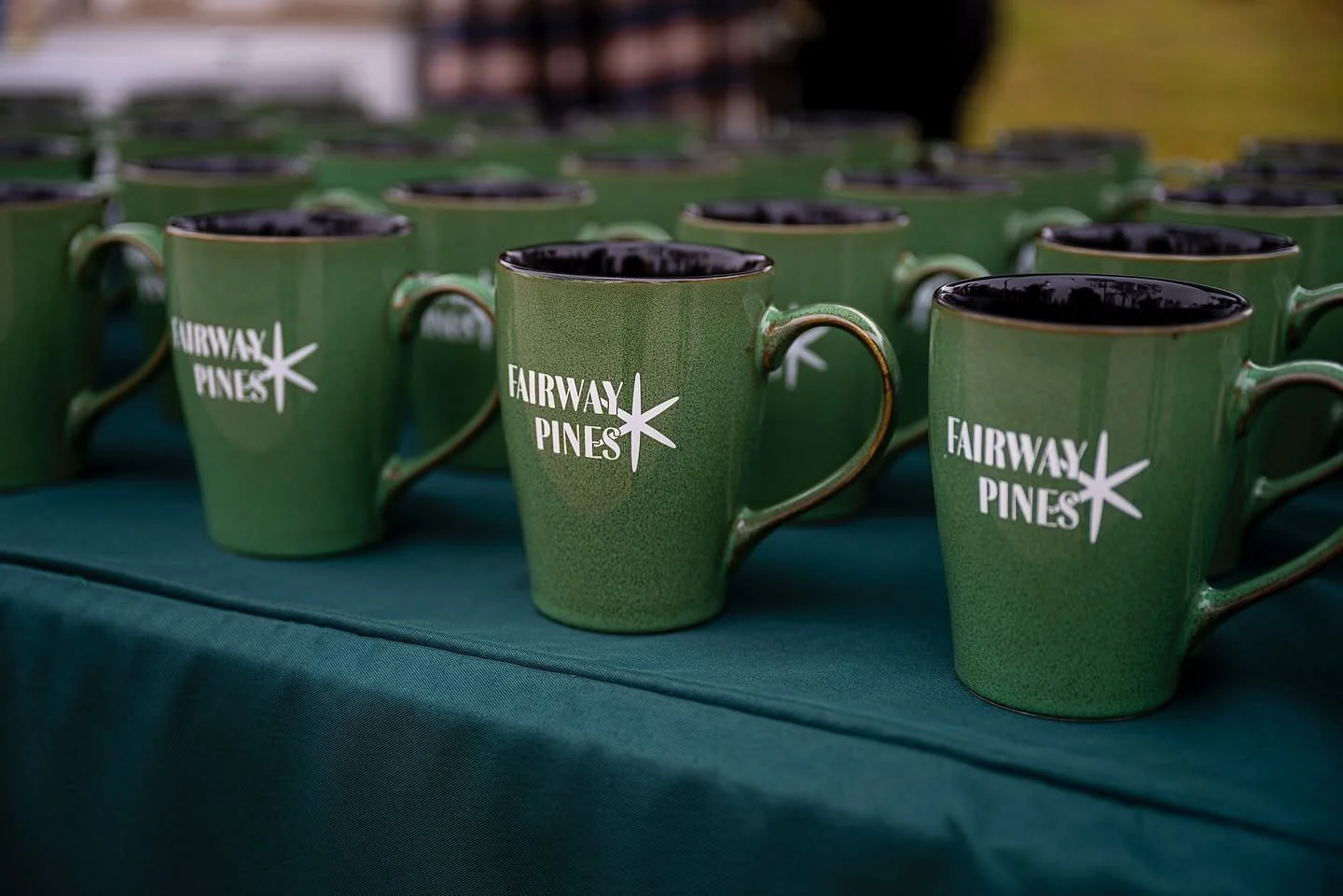
Once I completed the brand guidelines, the in-house design team at L&P Marketing took my visual assets and ran with them. They utilized the spot illustrations, icon library, color palettes, typography system, patterns, and textures to build out branded materials, from monument signage and wayfinding, to seasonal candles and postcards.
The Highlands says:
Our star logo stands as a beacon for everything The Highlands represents. A reminder that life truly shines brighter here—where community, nature, and activity come together in harmony.