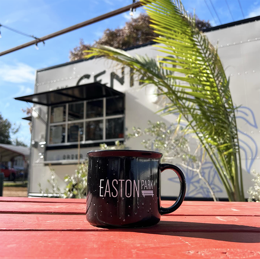
Easton Park
Austin, Texas
Role: Logo, Brand Identity, Print Collateral, Signage, Merch, Maps
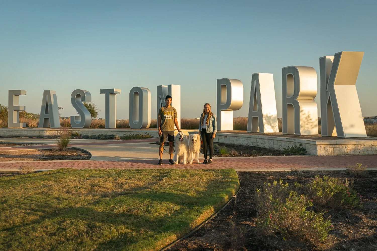
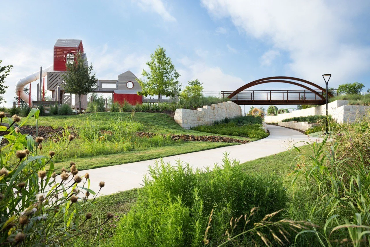
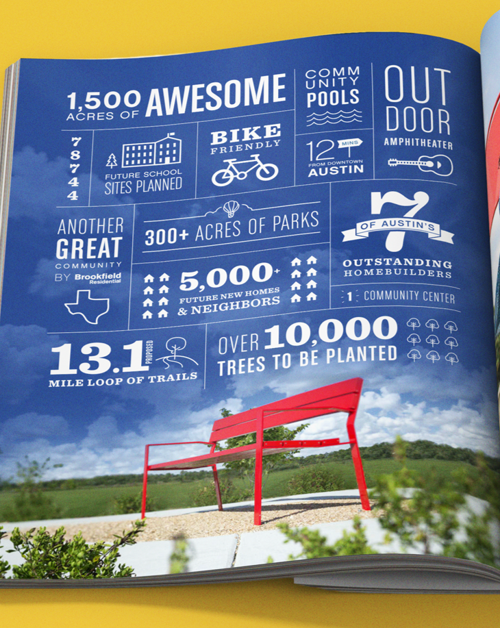
Located in Southeast Austin, Easton Park is a 2,700-acre master-planned community designed around connection, recreation, and the spirit of Austin living. With 13 miles of trails, expansive parks, and The Union — a 14,000 sq. ft. amenity center — the development blends outdoor lifestyle with vibrant neighborhood culture.
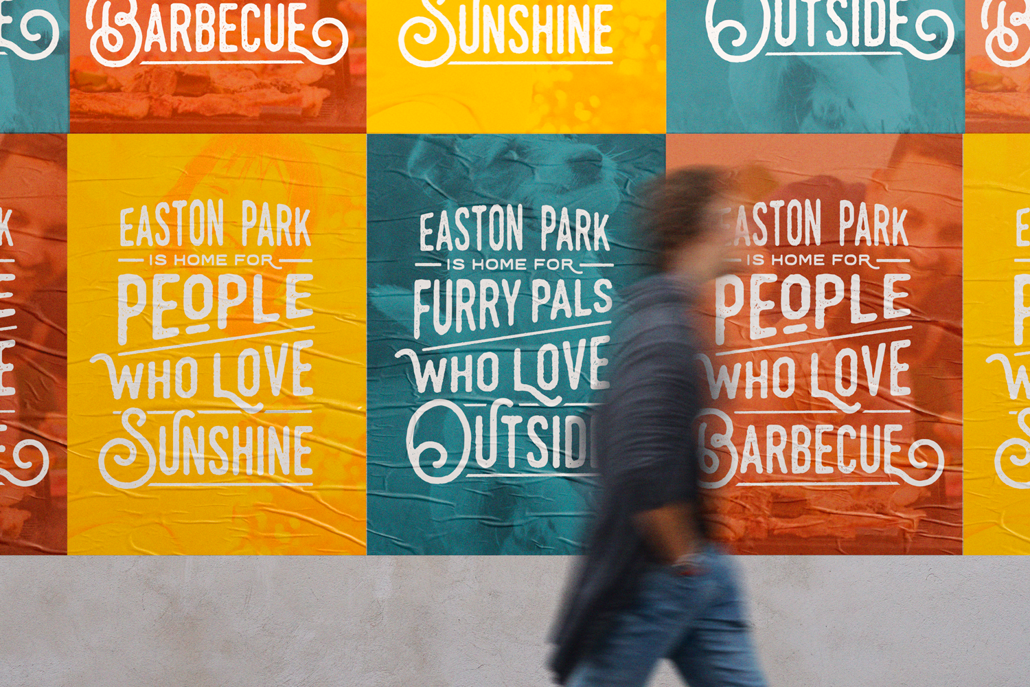
Hired by L&P Marketing, I was brought on to create a comprehensive visual identity system for the community. The project included logo development, brand identity, iconography, signage and wayfinding, environmental graphics and art installations, print collateral, and a wide range of marketing materials designed to bring the Easton Park brand experience to life across every touchpoint.
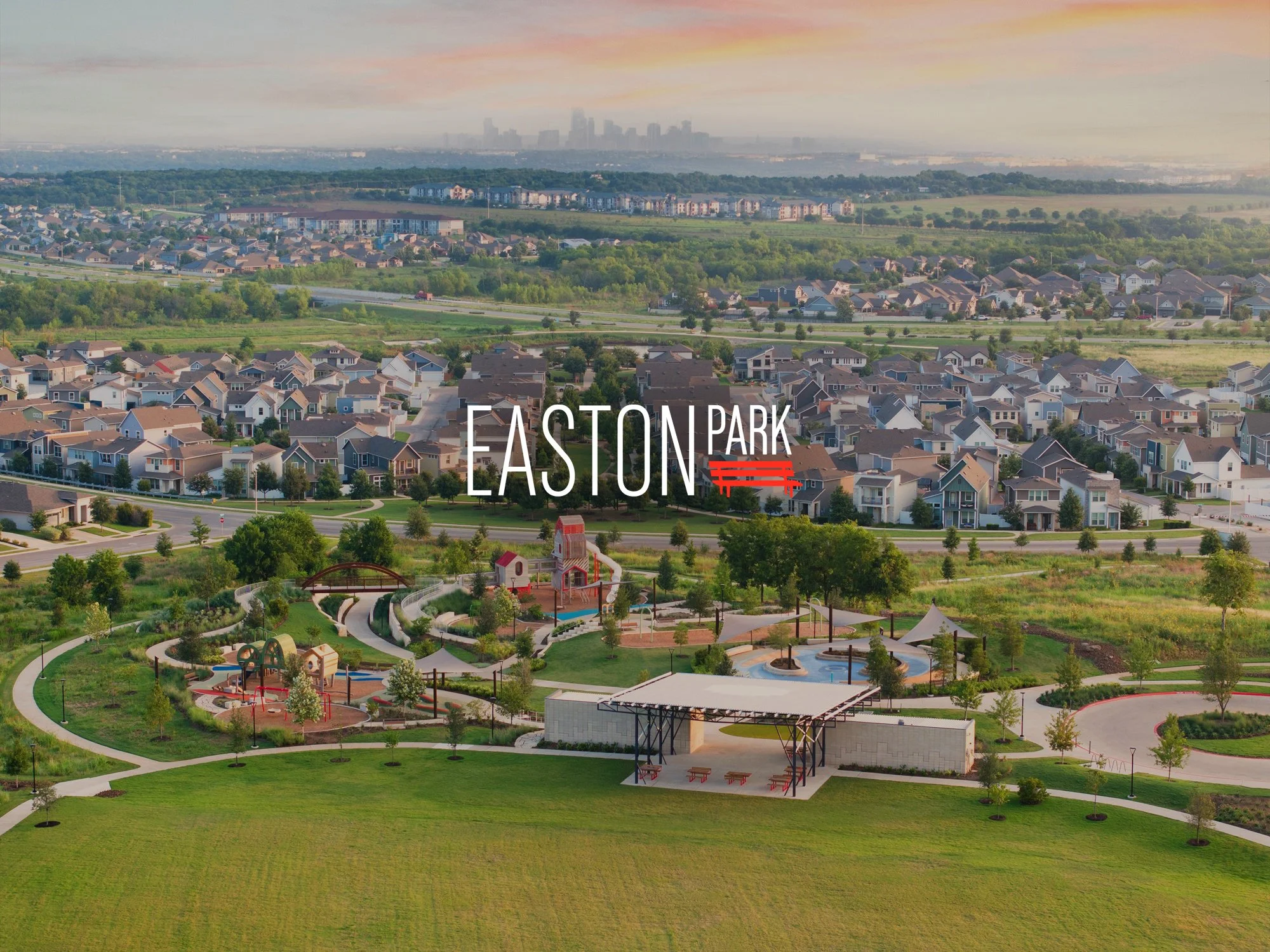
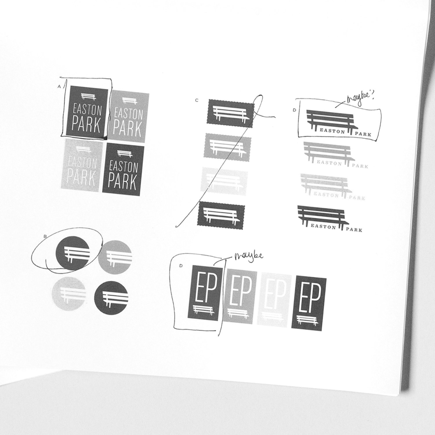
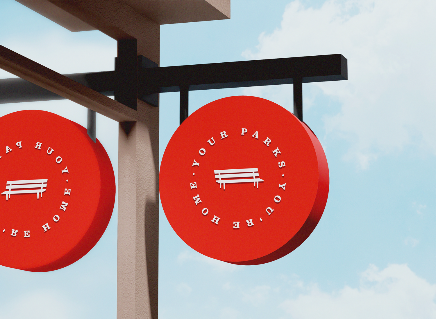
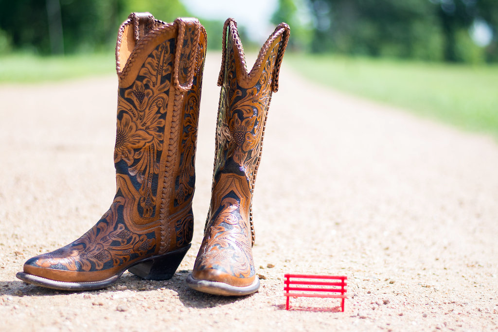
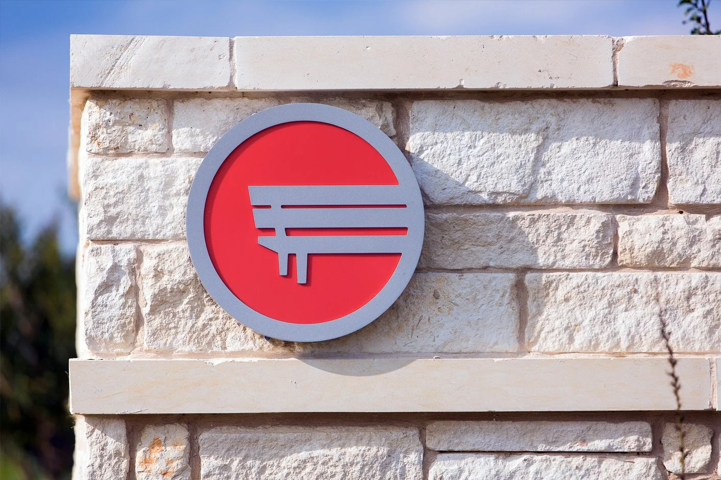
Even before ground was broken, Easton Park recognized the need for a distinctive visual identifier that would function not only as a logo mark, but as an iconic and recognizable element woven throughout the physical space. My goal was to create a mark that could live beyond traditional branding applications and become a physical, experiential part of the neighborhood environment.
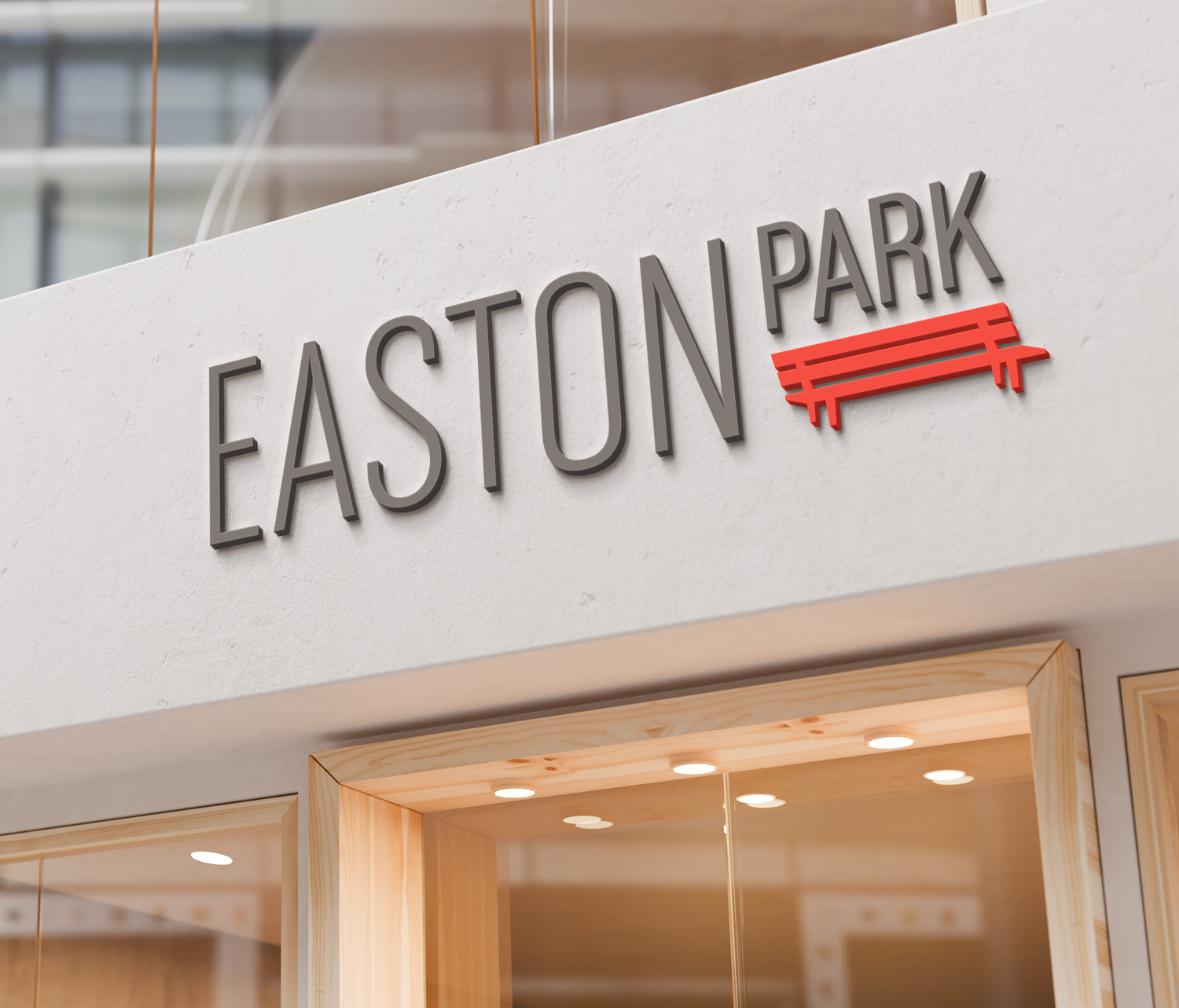

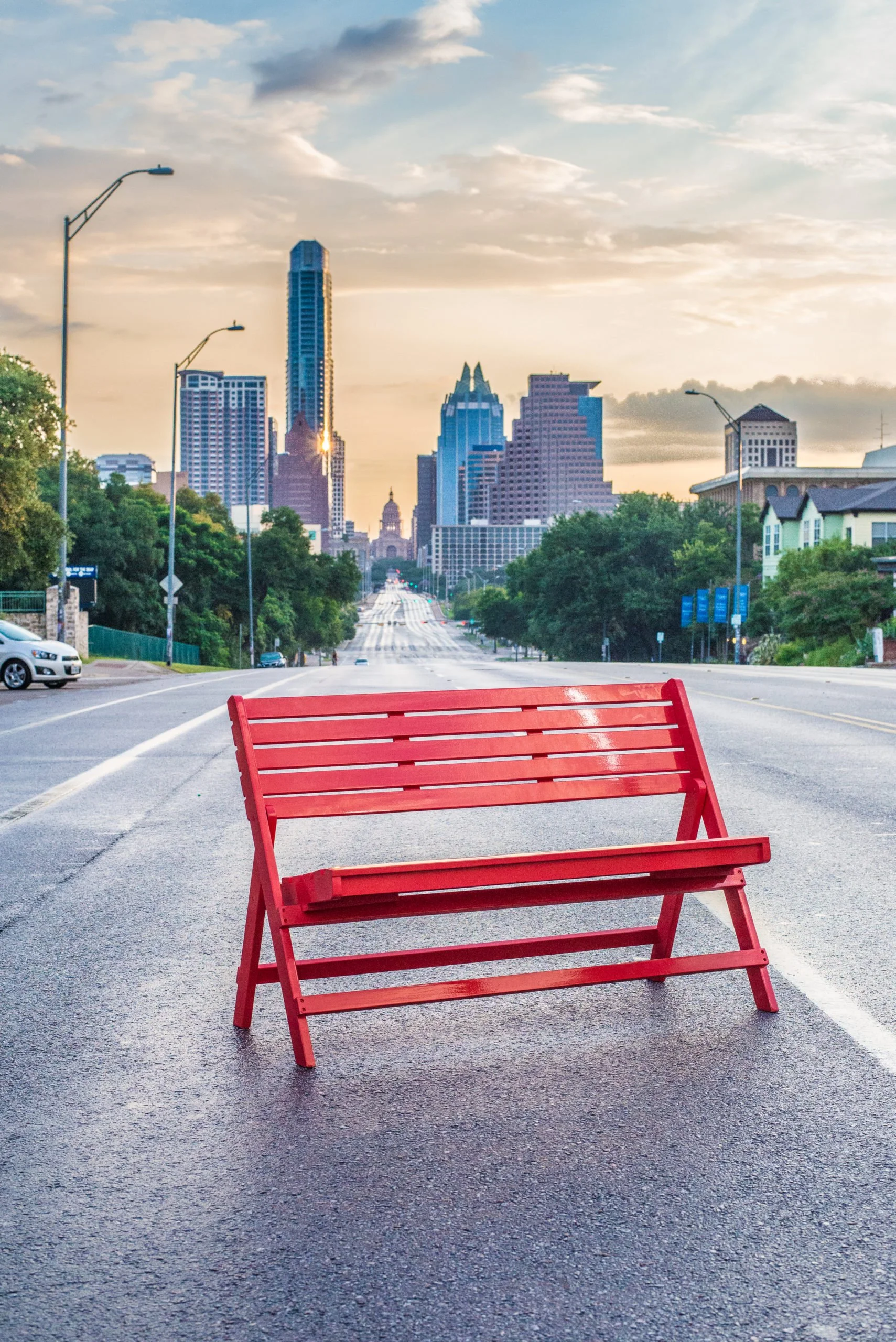
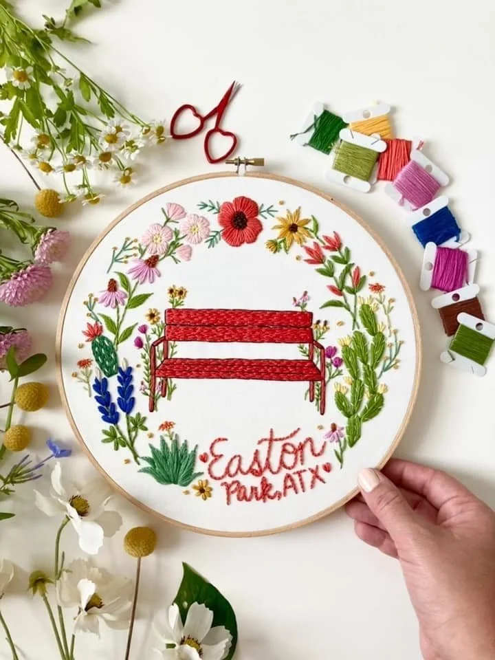
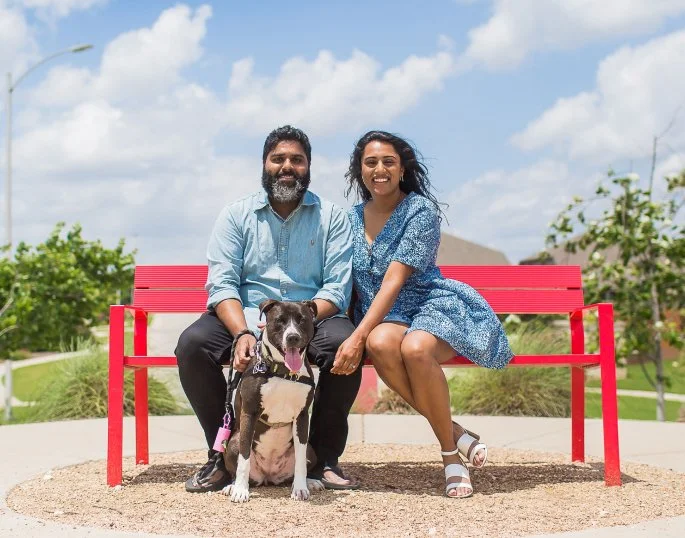
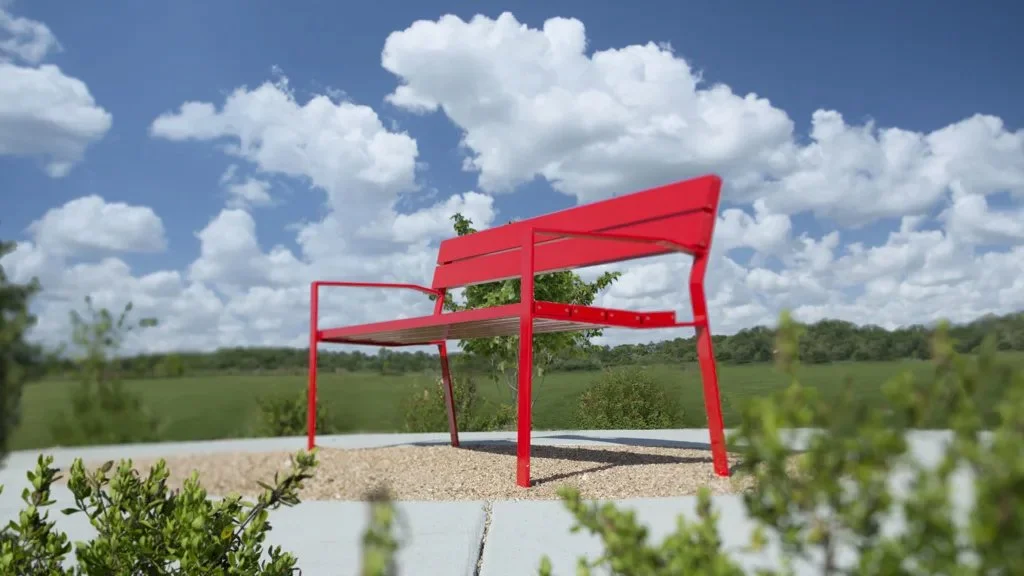
I explored a wide range of illustrative mark concepts – from footbridges to bike racks to lamp posts. But one idea stood apart: a red bench.
What began as a logo sketch evolved into the community’s most iconic visual feature. Ten-plus years later, custom red benches can be found throughout the neighborhood, including an oversized installation overlooking the vista.


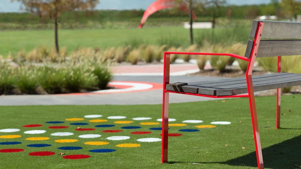
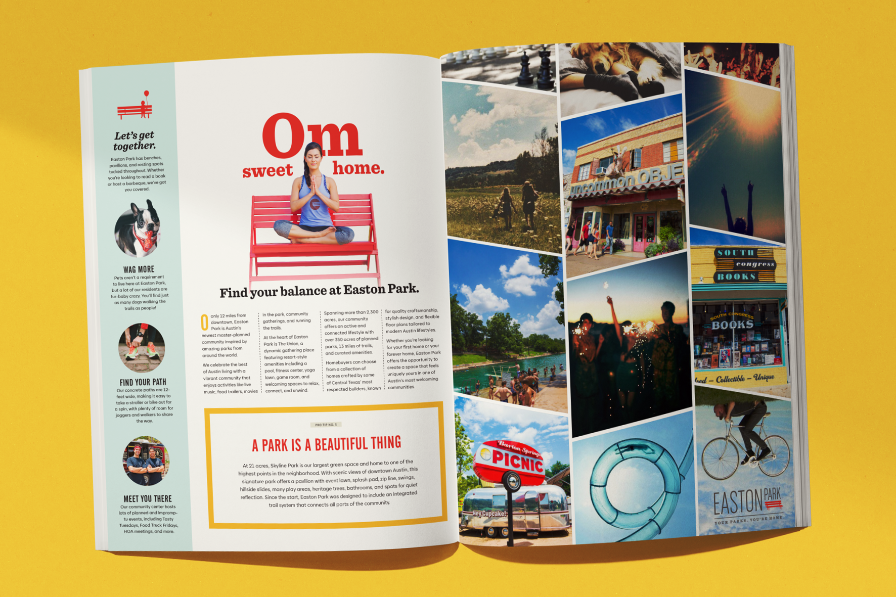


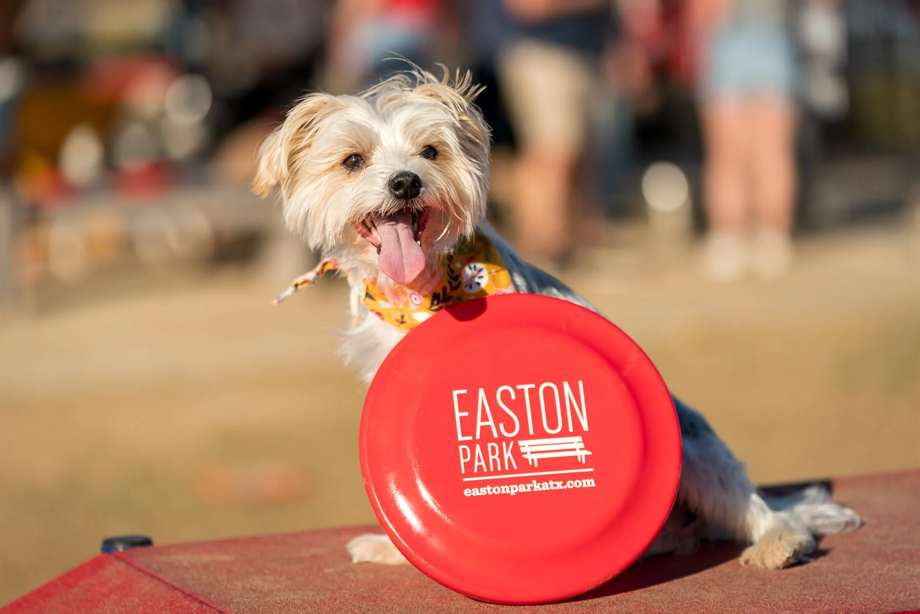
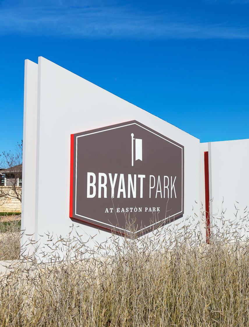
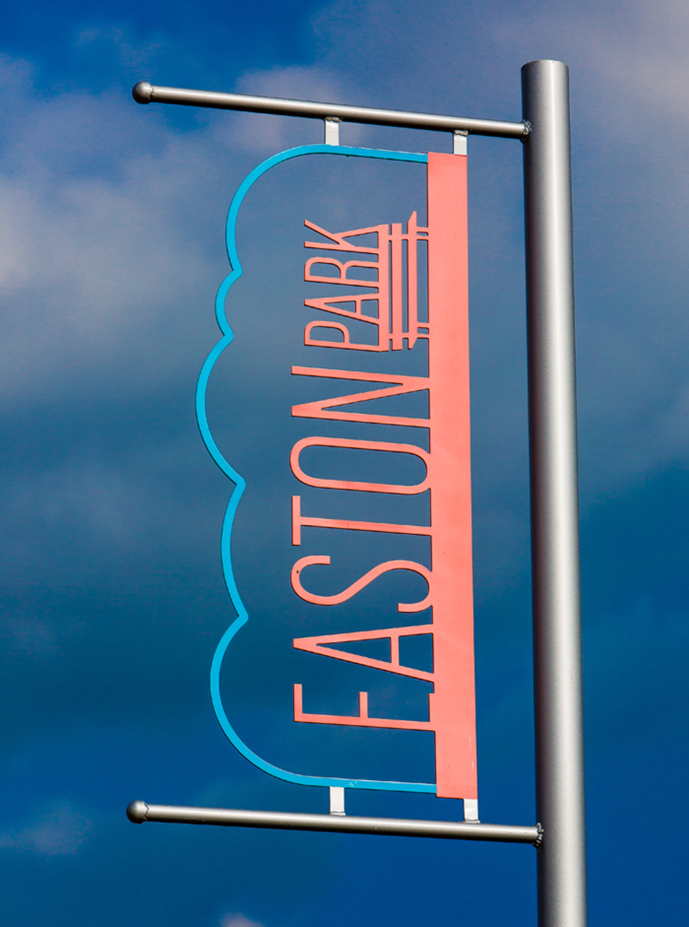
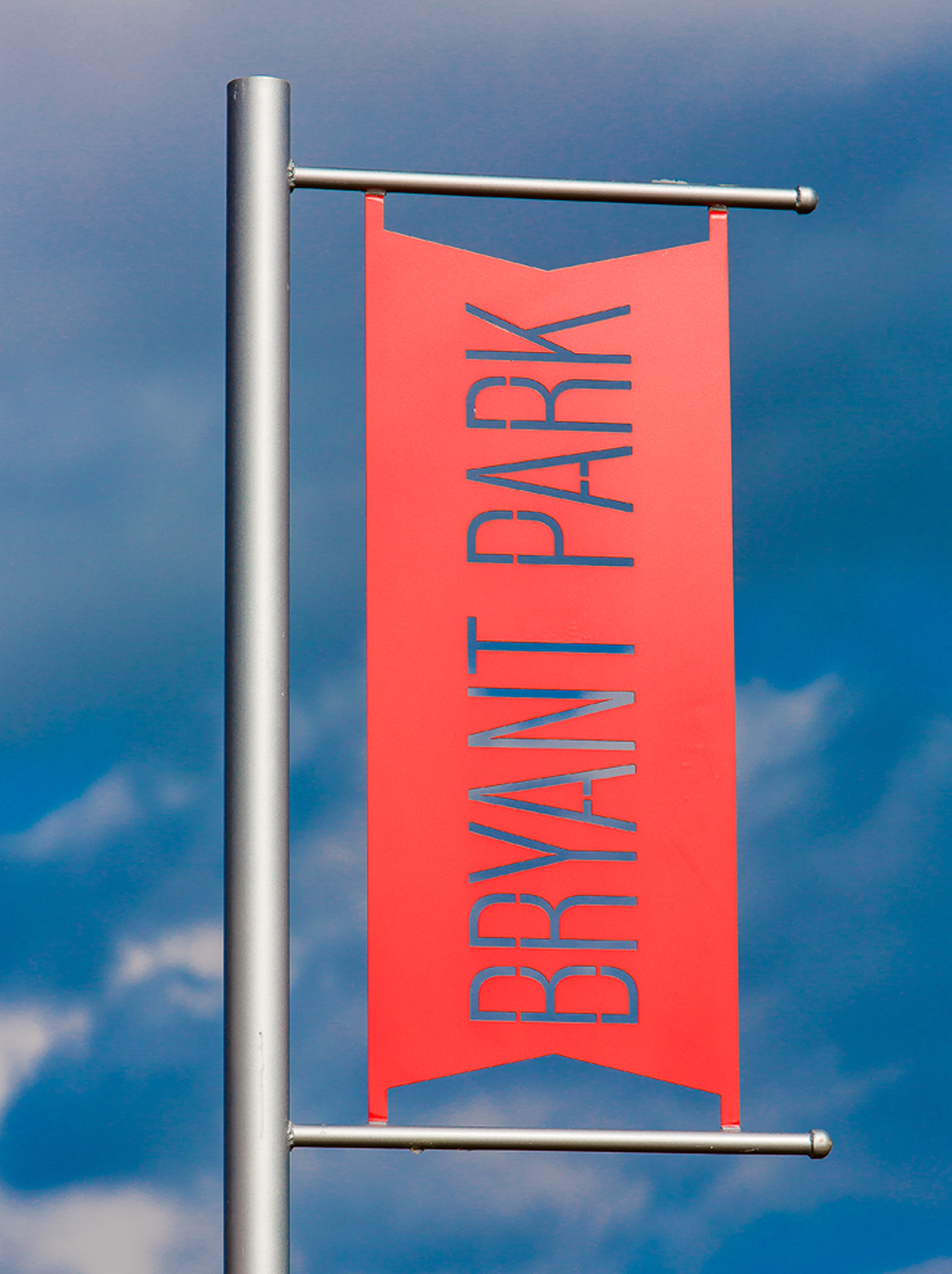
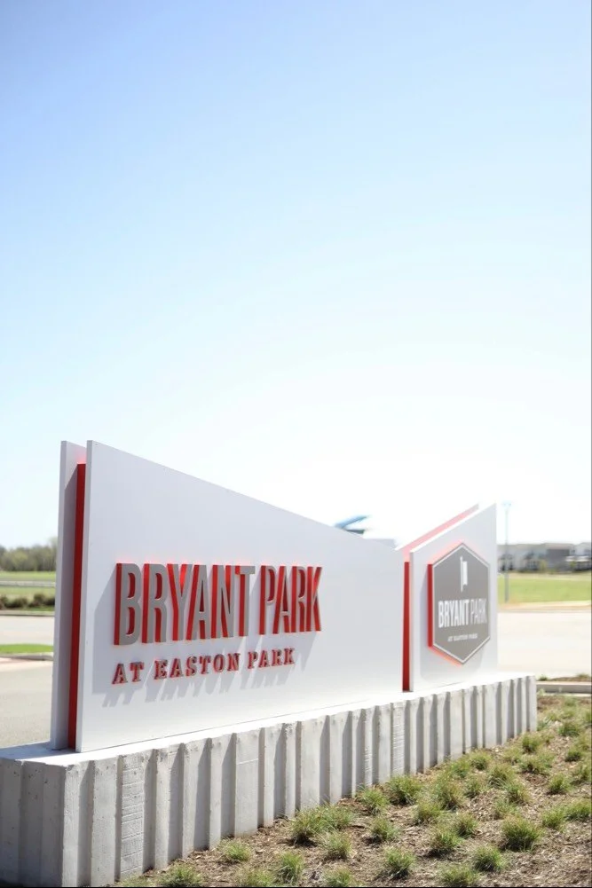
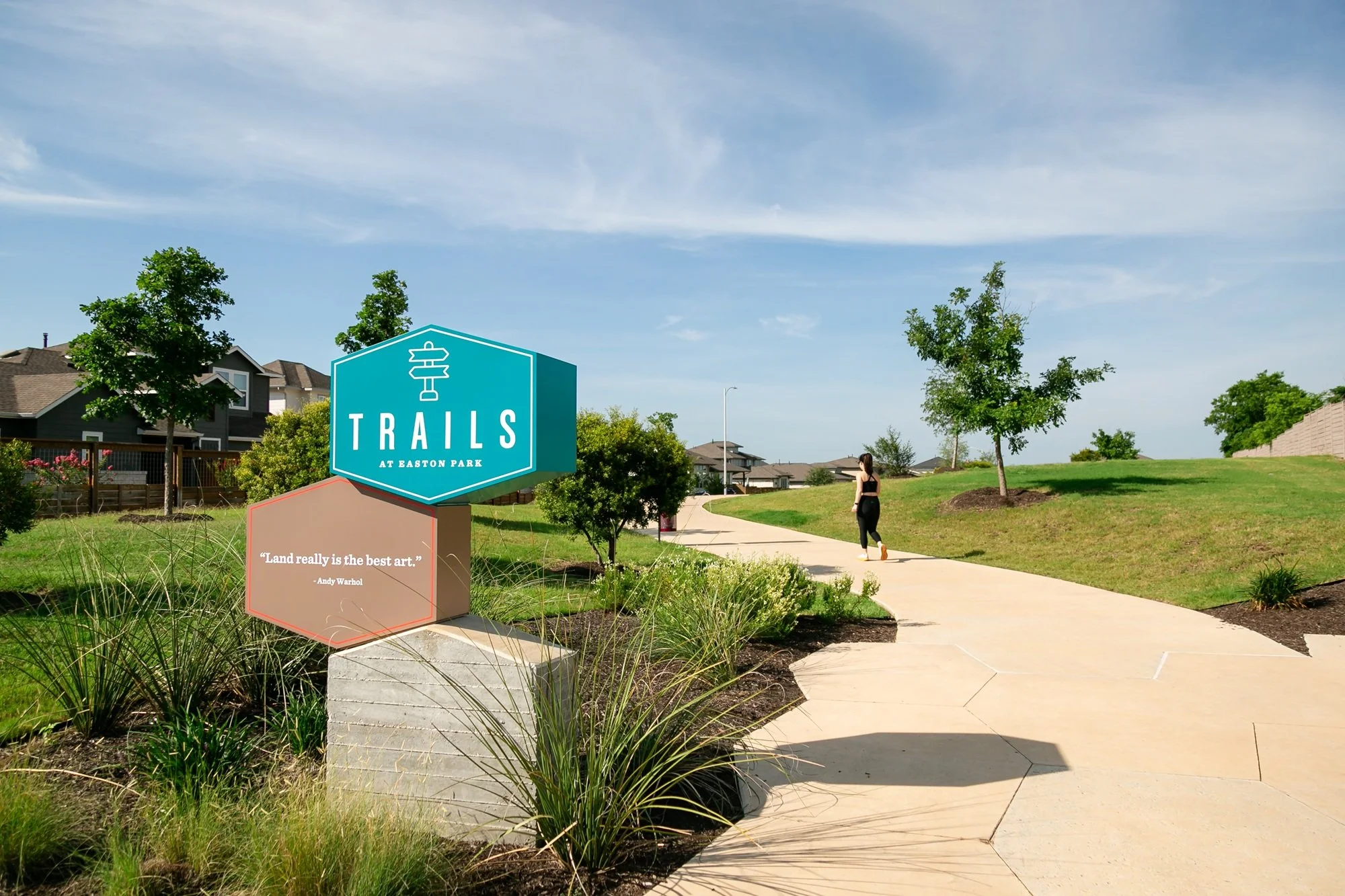
Once the logo and brand identity were established, the project expanded into a full suite of applications including signage, print collateral, and a neighborhood badge system.
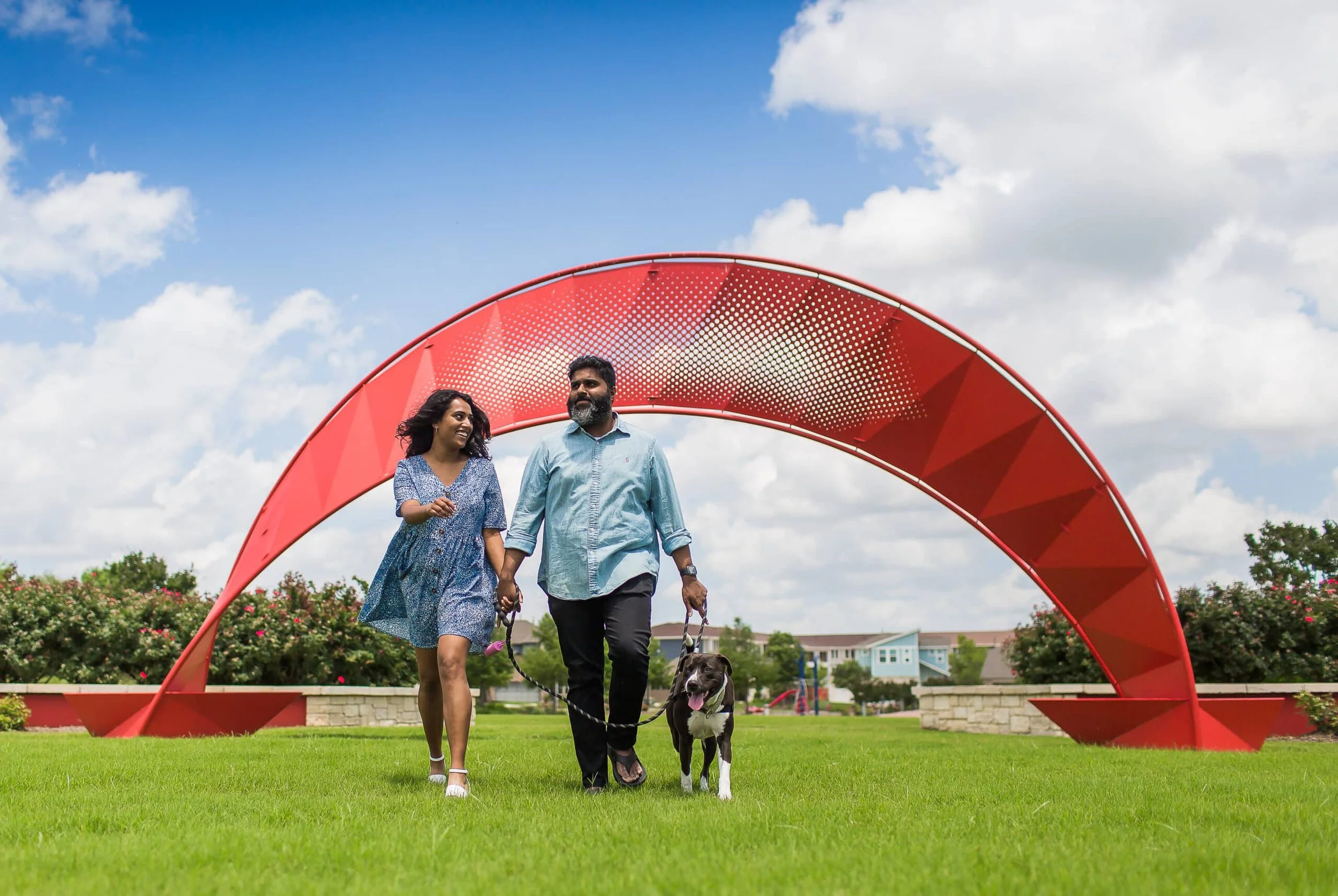
One of my favorite projects was to conceptualize and design a series of sculptural wayfinding installations. Inspired by the the artistry of Austin, the pieces incorporated illuminated elements, intricate metalwork, and interactivity to create landmarks that felt both functional and artistic. In collaboration with the team at L&P, several signs from the project received the NAHB National Award for Best Signage.


Easton Park says:
The red bench is the perfect metaphor for Easton Park. It’s a place where all kinds of people gather outdoors to enjoy nature. It can be a spot to socialize or meet an old friend—or a new one. The bench invites you to take a break and just breathe. And the cheerful red color stands out from the crowd and symbolizes the vibrant spirit of our community.
Life’s a bench!